Darkhorse Analytics is a data analytics and visualization consultancy that turns complex data into decision-ready visualizations and interactive tools.
Context
UX/UI redesign, components
2023 Mar - 2023 Apr
Company
Darkhorse Analytics
Emergency Services tool
My Role
UX/UI design student
Collaborative redesign
IDEATION
From complex data to clear, actionable visualizations.
The ideation phase focused on understanding how emergency services and analytics stakeholders consume data. We explored ways to turn dense datasets into decision-ready dashboards and interactive tools.
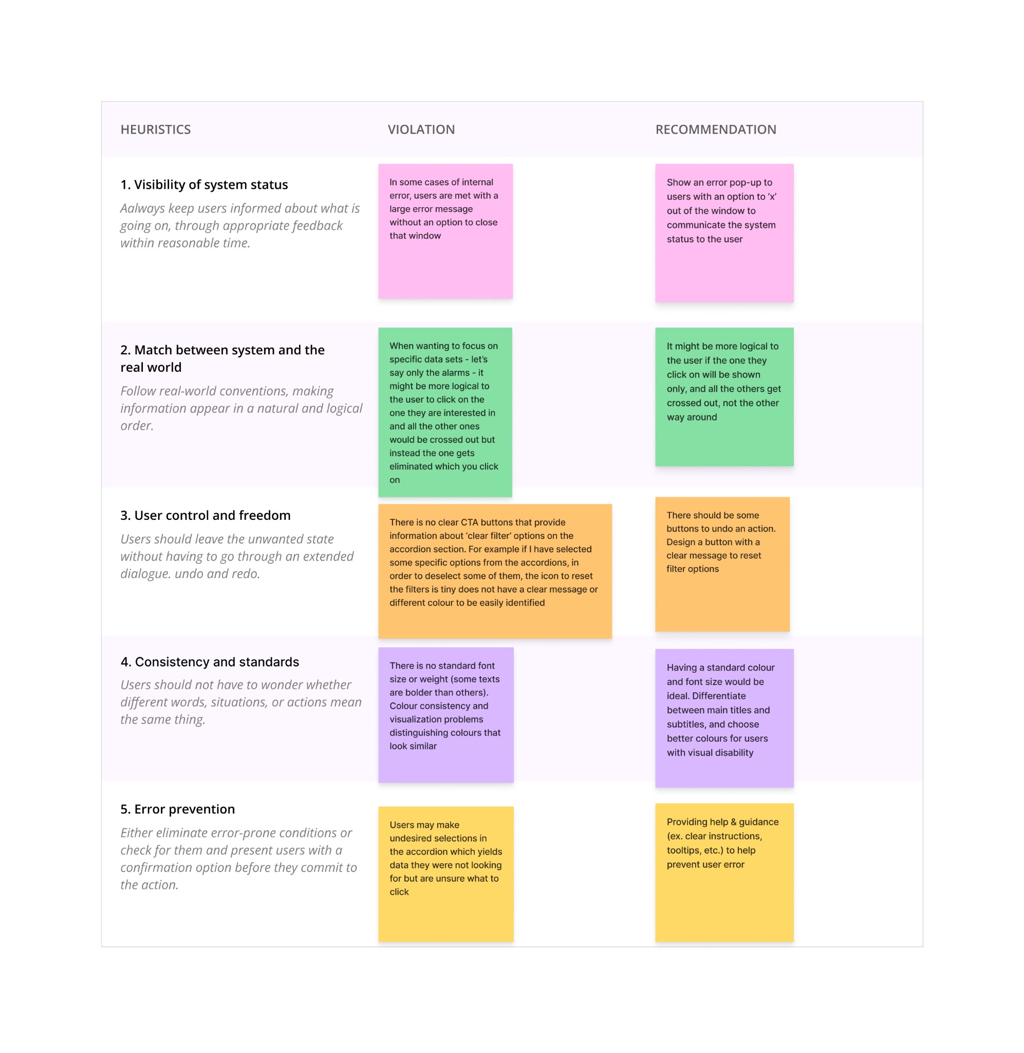
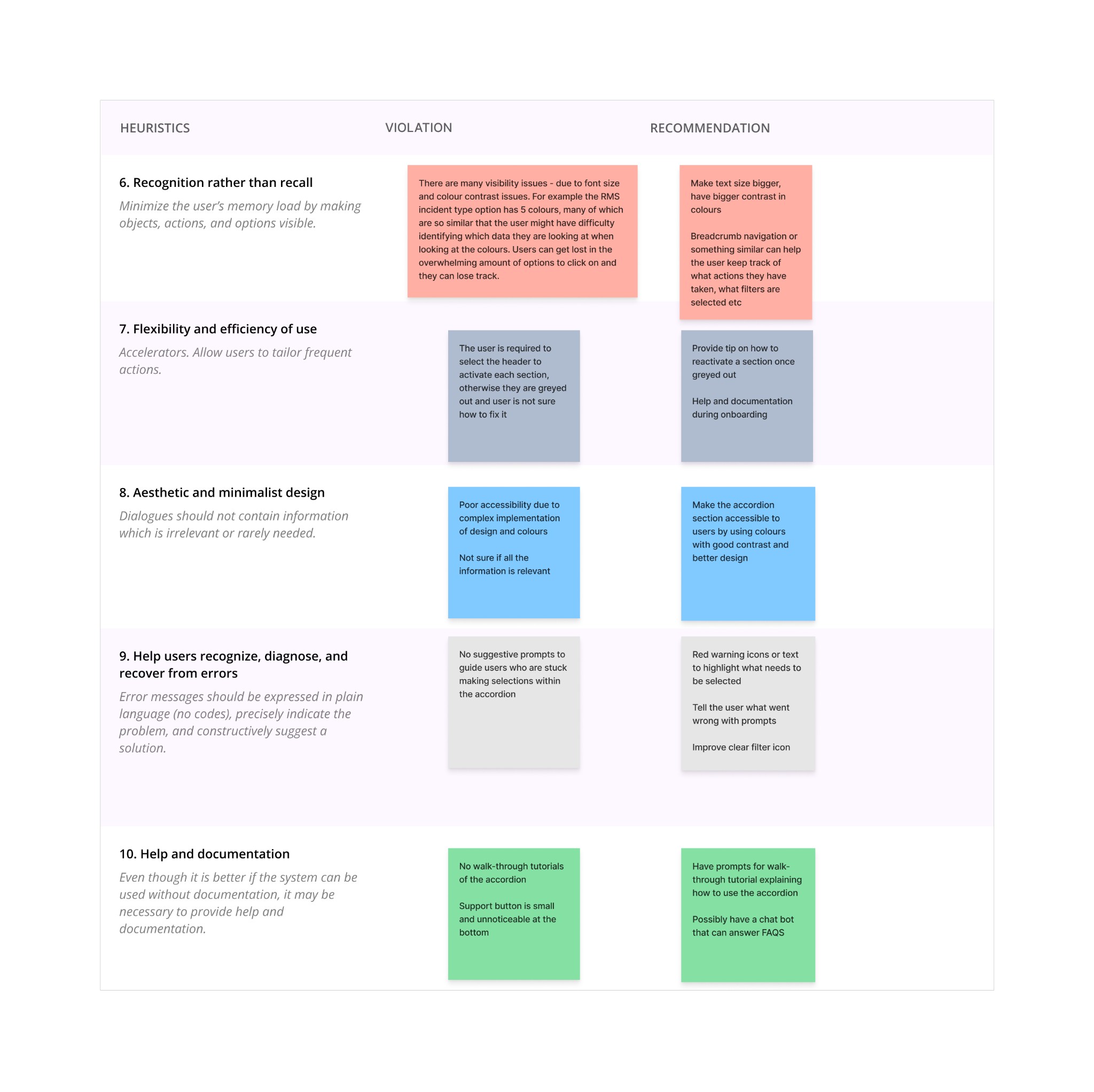
Heuristic Analysis
We evaluated the existing Emergency Services interface against usability heuristics to identify strengths and gaps. We found various usability issues in the diagnostics tool, such as low colour contrast ratios failing to meet the WCAG standards, absence of walk-through tutorials, small support buttons, and efficiency concerns.
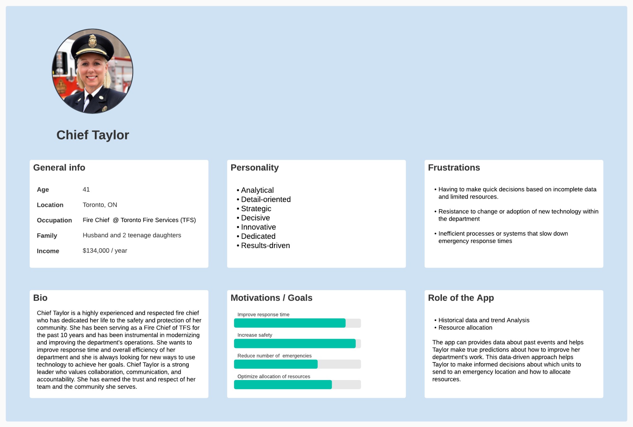
Persona
We summarized our findings and crafted a user persona to better understand our target audience, aiding us in designing effective solutions.
How might we
During the ideation phase we started brainstorming by asking "How might we" questions to encourage creative thinking, collaboration and exploration of potential solutions that allowed the team to approach problems from different perspectives and generate ideas that address user needs more effectively.
We asked questions such as:
How might we enhance the accordion's customization features to enable users to view data that is most relevant to them?
How might we design the accordion's visual elements to better represent the data and make it more accessible to users?
How might we provide proper accessibility to the users to reduce user frustrations?
How might we simplify the accordion's interface to improve usability and reduce user confusion?
Hypothesis
We hypothesized that improving colour contrast in the accordion and graphs, refining the selection feature, simplifying navigation, adding a tutorial, and including clear error messages would improve the Darkhorse emergency diagnostics tool’s accessibility and usability—reducing user confusion and frustration and enhancing the overall experience.
RESEARCH
Understanding user pain points and product context.
Through stakeholder interviews and product analysis, we identified key opportunities to improve the Emergency Services tool. The findings shaped the redesign of components and information hierarchy.
Our research approach
My team and I started by exploring the Darkhorse Analytics emergency diagnostics tool, its stakeholders and end users, and testing the app for usability issues. Our focus was mainly on the accordion’s design and function, and we looked at the app from an accessibility perspective as well.
We approached this stage as first-time users who had just landed on the site with the intention of completing simple tasks. We noted every difficulty we encountered and then reviewed them together as a team.
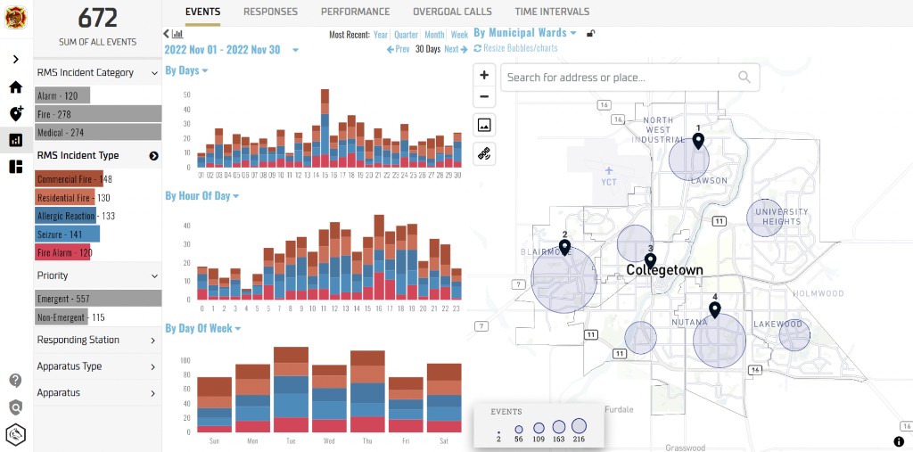
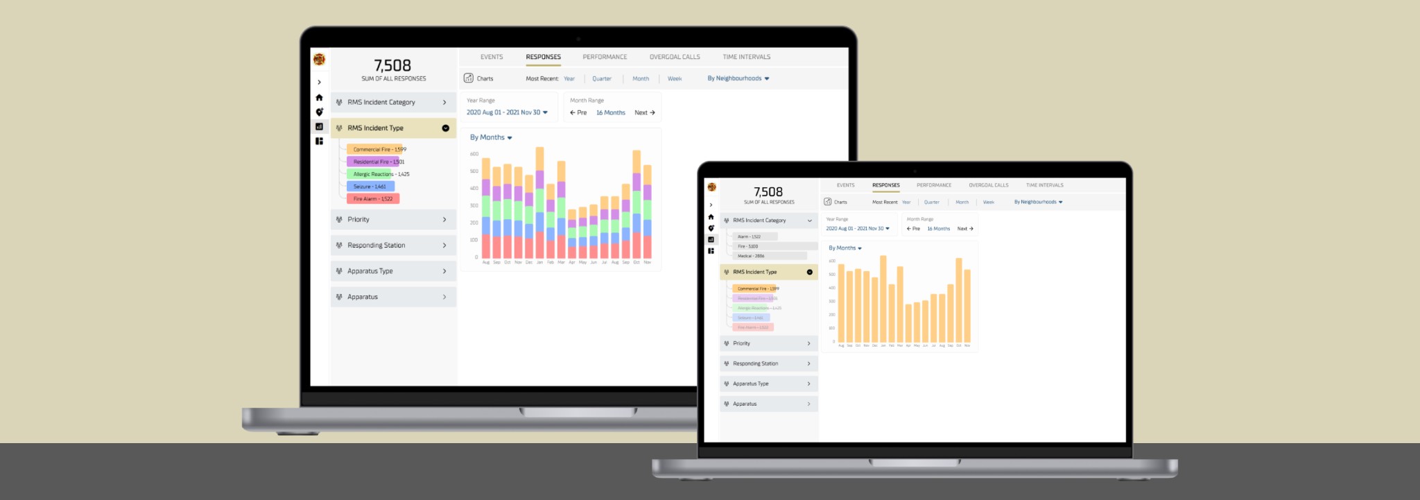
Original UI before redesign
DESIGN
Turning complex data into clear interfaces.
The design phase focused on component redesign, information hierarchy, and consistent patterns. We created reusable accordion and dashboard components that scale across the Emergency Services tool.
Colour contrast: before & after
We evaluated and redesigned colour combinations across the accordion and charts to meet WCAG Normal AAA (7:1 contrast). The result was a move from failing contrast ratios to full compliance, improving readability and accessibility.
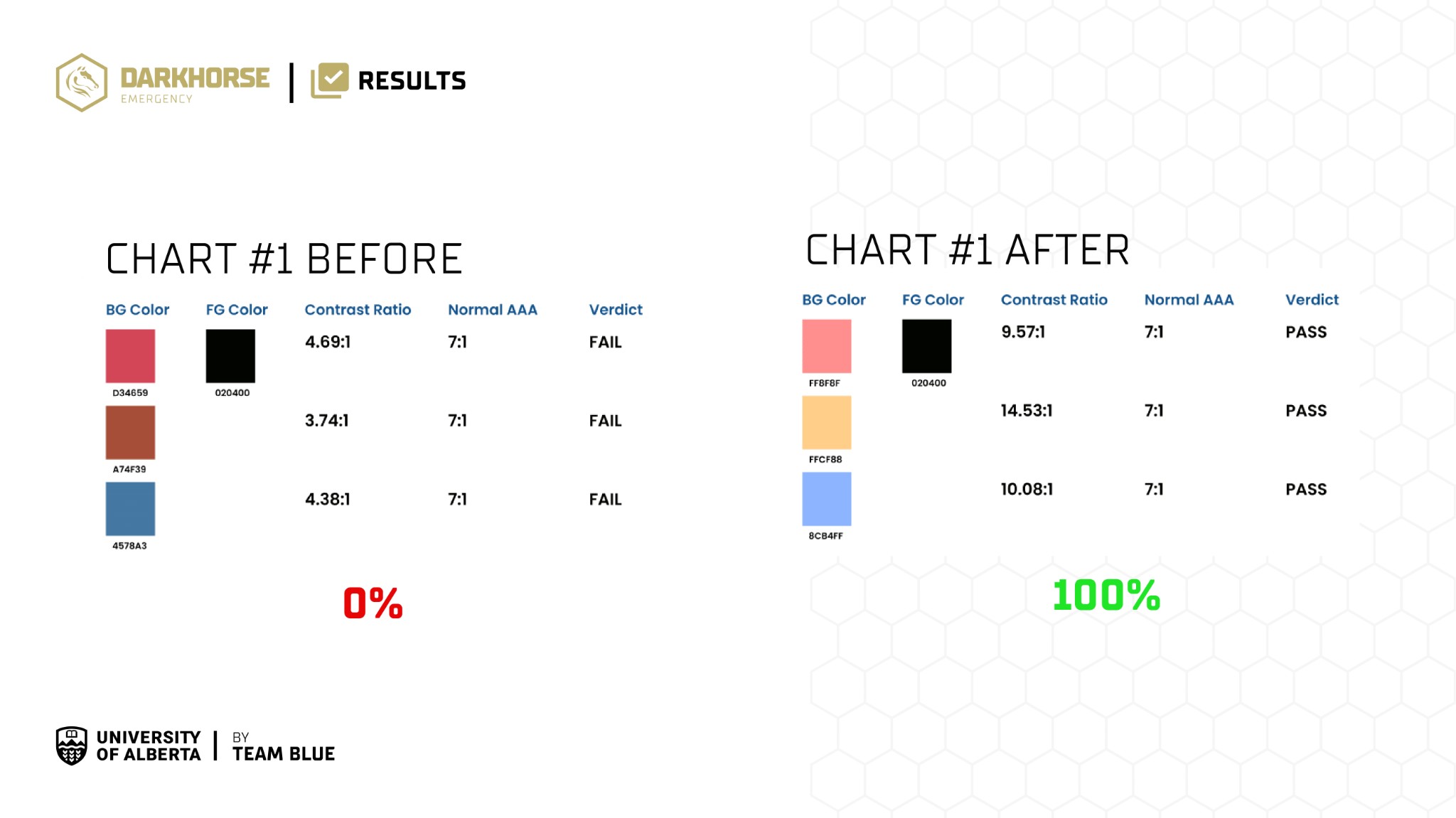
Contrast ratio evaluation — before (0% pass) vs after (100% pass) for WCAG AAA
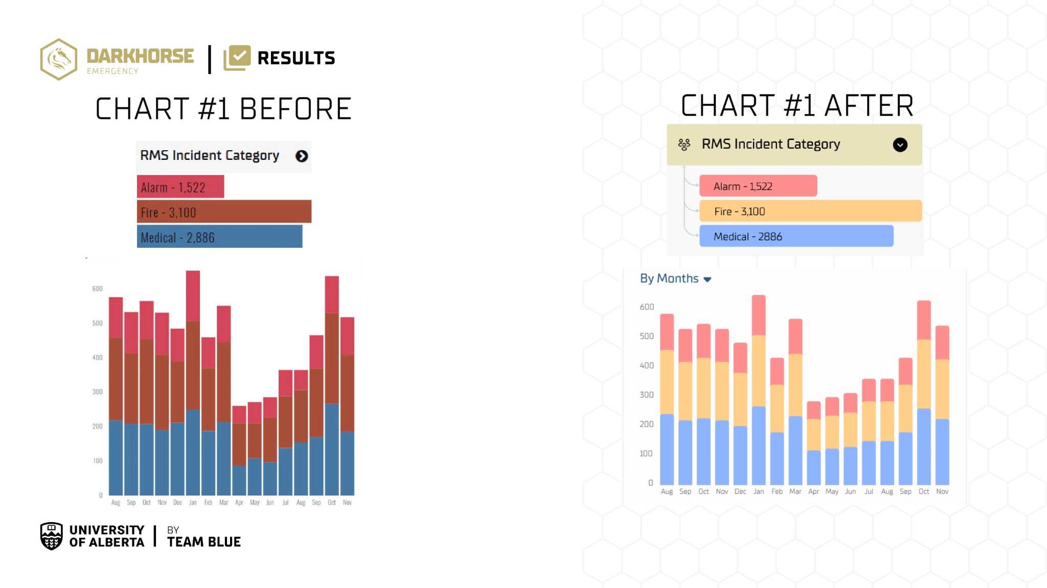
Chart and legend — before vs after colour palette for better distinction and accessibility
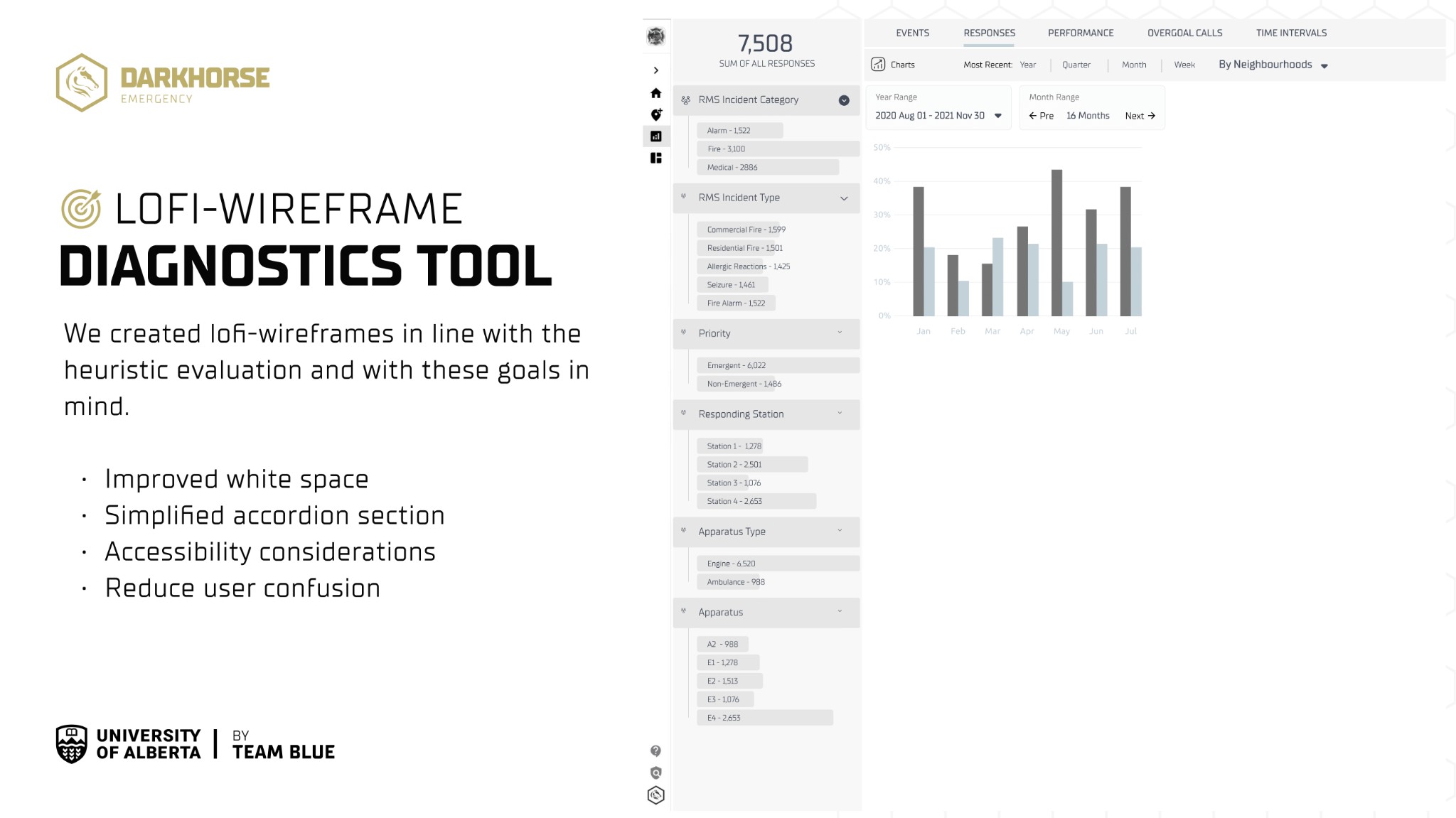
Sketching & Wireframing
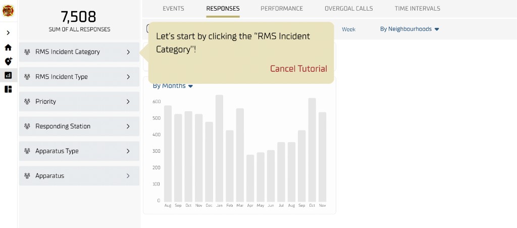
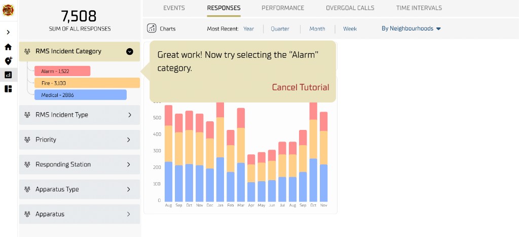
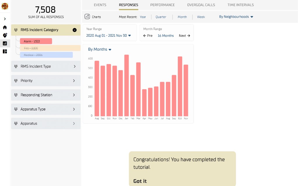
We created low-fidelity wireframes aligned with the heuristic evaluation, focusing on improved white space, a simplified accordion section, accessibility, and reduced user confusion. The progression from wireframe to high-fidelity UI includes an interactive walk-through tutorial.
Early Testing & Refinements
The wireframes went through multiple rounds of revision and testing with stakeholder and end-user feedback. We then ran usability testing with an analyst who knew the product, refined the design from those insights, and prioritized user feedback so the final solution was clear, efficient, and met real user needs.
Revise
Stakeholder and end-user feedback shaped numerous wireframe revisions.
Test
Usability testing with a product-familiar analyst validated changes and surfaced remaining issues.
Refine
Insights were integrated into a polished, user-centered wireframe.
Final Tests, Refinements, Handoff
We made several changes to improve usability, accessibility, and user satisfaction. We held a final presentation to walk through our design choices and recommendations, then handed off all documented work to the Darkhorse design team.
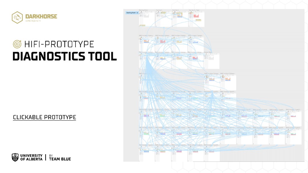
Hi-fi prototype — clickable prototype and user flow